Contact
All enquiries related to this document can be emailed to product@netaxis.be.
Introduction
A Brave New World
The habits and requirements of consumers changed dramatically in the last decade. The rise of the internet has not only changed the way people interact with eachothers but as well how they (want to) interact with businesses. As consumers we are used to get reporting on the manner we consume a service.
This is the reason why Netaxis has developped Nemo. Nemo is an All-In-One product covering the following functions:
Reporting
Monitoring
Troubleshooting
Alarming
Fraud detection
Nemo is a vendor agnostic reporting and monitoring platform, designed to provide relevant insights about the usage of a voice service by gathering data using probes and CDRs.
Key Features
Reporting
The reporting aspect of NEMO is particularly strong, allowing network operators to
flexibly "slice and dice" information for resellers and end-users in many ways: by reseller,customer, site, individual end-user etc. This flexibility, combined with the fact that NEMO is natively multi-tenant and comes with fine-grained user profile definition,gives the possibility to make the NEMO portal accessible to different types of users: from very technically skilled engineers for troubleshooting, to customers for end-user reporting only.
Reporting information can be consulted via a web portal and/or in .pdf/docx report that are automatically created by NEMO based on template.
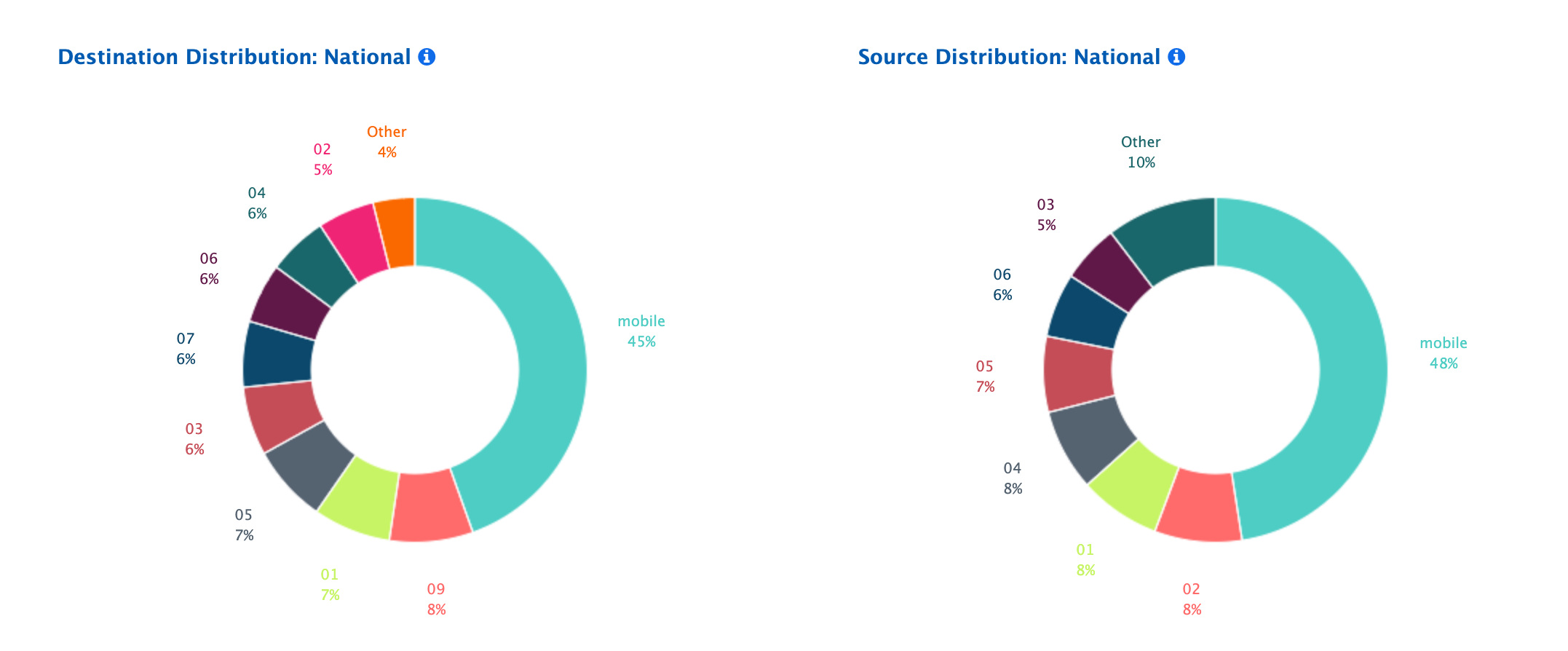
Here is an example of .pdf report that can be automatically created by Nemo platform.
Broadworks Analytics
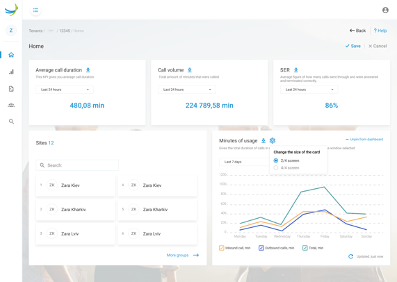
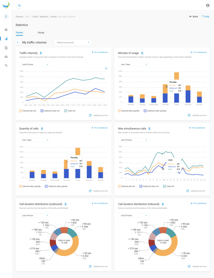
NEMO serves as call analytics engine four Netaxis Broadworks self-care portal. The Netaxis Broadworks self-care portal is therefore enrich with call analytics information and exposes beautifull and customizable graphs for tenants and groups Moreover admins will have access to KPIs and CDRs for any user in their organization
Monitoring/Troubleshooting (Network Probes Needed)
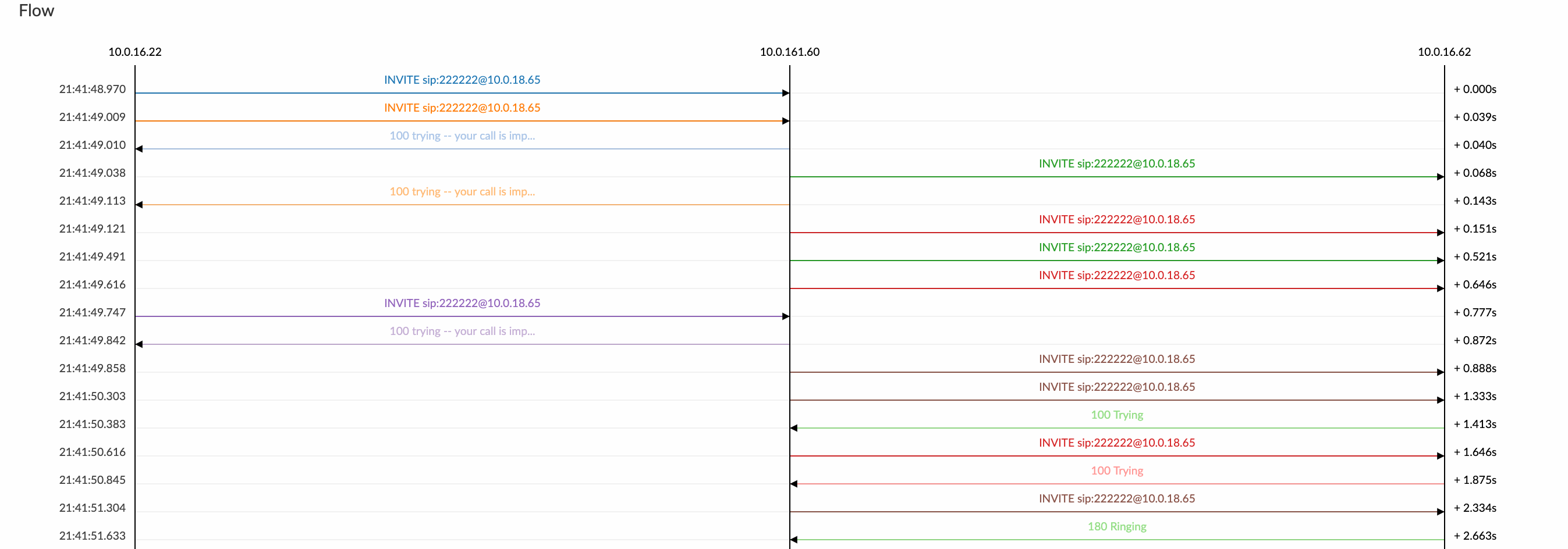
The gathering of SIP/RTP data using probes allows NEMO to troubleshoot problems with calls, by providing end-to-end call flows, SIP message details, media stream analysis and media replay possibility. Netaxis Solutions' probes are not only passive probes that sniff the network traffic: they are also capable of analyzing traffic patterns that will be monitored by NEMO.
RTP Media Recording
Thanks to its probes, NEMO can not only produce statistics about the RTP packets captured but it can also playback this RTP media right from the browser (without the need for any plugins). Decoding of the codecs G711a, G711u, G729, G723, AMR-WB and AMR-NB is supported. This feature allows the service provider to debug voice-related issues in the network.
Simultaneous Multi-Devices Support
A single NEMO platform can collect CDR data from various network equipment simultaneously, no matter if these equipment provide different metrics in their CDR data (RTP metrics vs. SIP metrics vs. SS7 metrics). On top of that, thanks to probes, NEMO can correlate CDR data with packets captured from probes and provide an all-in-one view about calls: both metadata (e.g. trunk name, customer name, ...) from the network equipment under monitoring and network data for troubleshooting.
Supported devices:
- Netaxis Probes
- Netaxis SRE
- Oracle SBC
- Cisco Broadworks
- Audiocodes Mediant
- Metaswitch
- Italtel Softswitch
- Ribbon SBC
Alarming
Alarm types, criteria and thresholds can be easily defined and modified from a large set of pre-defined alarms. Thanks to its traffic patterns' analysis engine, NEMO is able to detect traffic anomalies that are not usually notified via discrete alarms (such as SNMP traps): sudden call rate drop, abnormal call duration, high error rate, and more.
Custom Metrics
Nemo comes with a pre-defined set of KPI (see appendix); however for flexibility sake, Nemo provides also the possibility to create custom metrics based on CDR's fields and regular expression.
API Exposure
As a vendor agnostic solution, Nemo expose API for both privisoing but also to retrive staticistics. This allows smooth integration with existing reporting solution.
Architecure
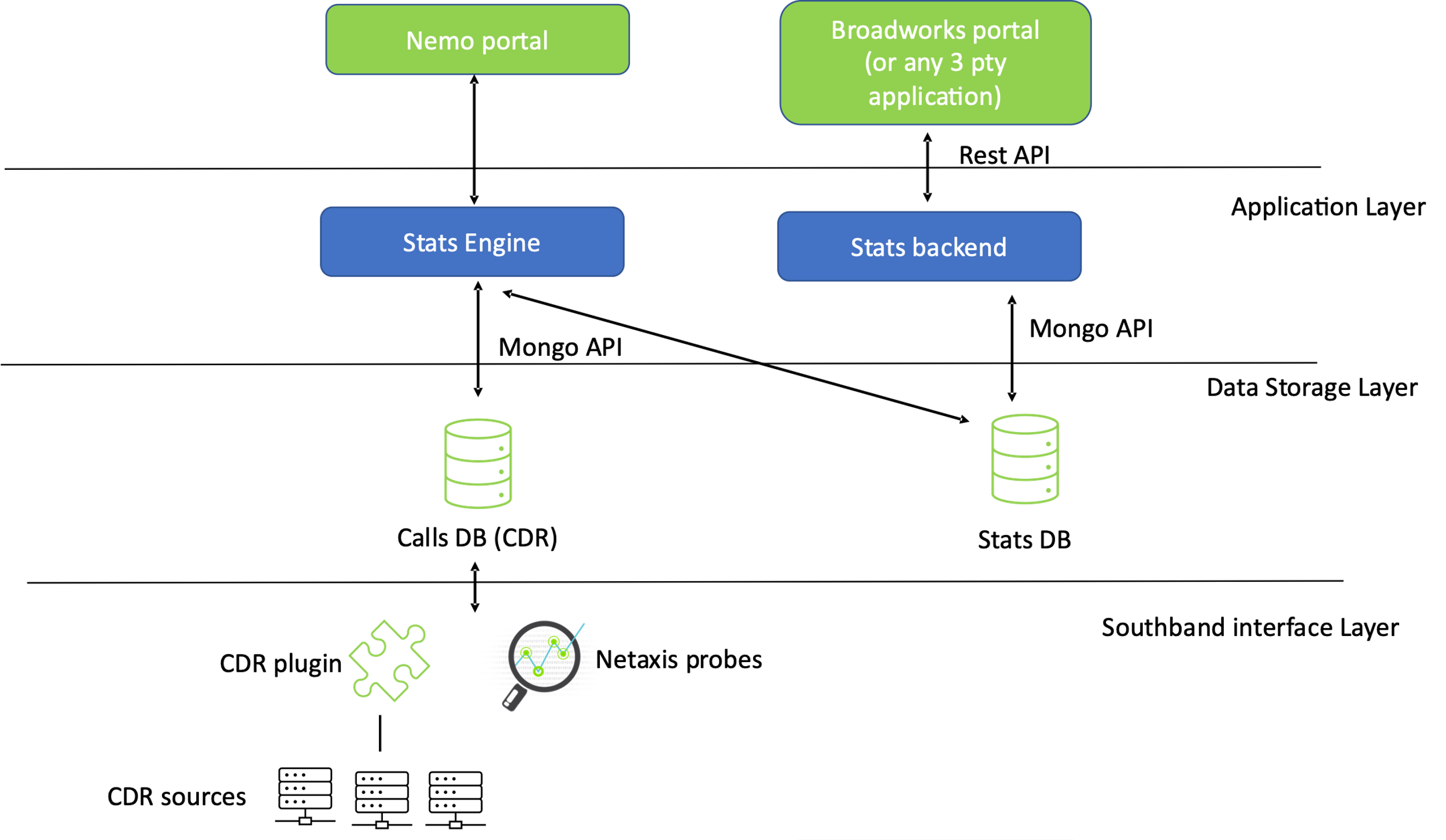
NEMO logical architecture is a three-layer one: Interface Layer, Data Storage Layer and Application Layer.
NEMO has been designed to be modular: all these logical layers can either run on the same physical entity or be spread on different physical entities.
One NEMO application can handle several CDR's sources (eg. SBC, Broadworks, Probes ...)
Out of the Box KPI
The table below is the list of KPI natively supported by NEMO. On top of these built-in KPIs, custom metrics and graphs can be configured.
INFO
Availability of these KPIs depends on the plugins and metrics available in CDR data.
| Title | Description |
|---|---|
| Total Capacity Usage | This chart illustrates the proportion of time where various levels of total capacity usage have been reached. |
| Minutes of Usage | Minutes of Usage describes the total duration of calls in minutes, hourly or daily, depending on the window of time selected. |
| Calls Count over Time | Calls count per hour or per day. |
| Traffic Intensity | Traffic intensity describes the average number of concurrent calls in progress. The erlang is the unit used to represent this measurement. |
| Max Simultaneous Calls | The maximum simultaneous calls is the maximum number of concurrent calls observed. |
| Call Rate | The call rate is the number of call attempts (successful and failed) per second. |
| Active Registrations | The active registrations is the number of successfully registered subscribers. |
| Registrations Rate | The registrations rate is the number of registration attempts (successful and failed) per second. |
| Ingress Callee Distribution: National vs International (Count) | This chart illustrates the called party number distribution between national and international calls. Calculation is based on number of calls. |
| Ingress Callee Distribution: National (Count) | This chart illustrates the called party number distribution for national calls. Calculation is based on number of calls. |
| Ingress Callee Distribution: International (Count) | This chart illustrates the called party number distribution for international calls. Calculation is based on number of calls. |
| Egress Callee Distribution: National vs International (Count) | This chart illustrates the called party number distribution between national and international calls. Calculation is based on number of calls. |
| Egress Callee Distribution: National (Count) | This chart illustrates the called party number distribution for national calls. Calculation is based on number of calls. |
| Egress Callee Distribution: International (Count) | This chart illustrates the called party number distribution for international calls. Calculation is based on number of calls. |
| Egress Caller Distribution: National vs International (Count) | This chart illustrates the calling party number distribution between national and international calls. Calculation is based on number of calls. |
| Egress Caller Distribution: National (Count) | This chart illustrates the calling party number distribution for national calls. Calculation is based on number of calls. |
| Egress Caller Distribution: International (Count) | This chart illustrates the calling party number distribution for international calls. Calculation is based on number of calls. |
| Ingress Caller Distribution: National vs International (Count) | This chart illustrates the calling party number distribution between national and international calls. Calculation is based on number of calls. |
| Ingress Caller Distribution: National (Count) | This chart illustrates the calling party number distribution for national calls. Calculation is based on number of calls. |
| Ingress Caller Distribution: International (Count) | This chart illustrates the calling party number distribution for international calls. Calculation is based on number of calls. |
| Ingress Callee Distribution: National vs International (Volume) | This chart illustrates the called party number distribution between national and international calls. Calculation is based on volume. |
| Ingress Callee Distribution: National (Volume) | This chart illustrates the called party number distribution for national calls. Calculation is based on volume. |
| Ingress Callee Distribution: International (Volume) | This chart illustrates the called party number distribution for international calls. Calculation is based on volume. |
| Egress Callee Distribution: National vs International (Volume) | This chart illustrates the called party number distribution between national and international calls. Calculation is based on volume. |
| Egress Callee Distribution: National (Volume) | This chart illustrates the called party number distribution for national calls. Calculation is based on volume. |
| Egress Callee Distribution: International (Volume) | This chart illustrates the called party number distribution for international calls. Calculation is based on volume. |
| Egress Caller Distribution: National vs International (Volume) | This chart illustrates the calling party number distribution between national and international calls. Calculation is based on volume. |
| Egress Caller Distribution: National (Volume) | This chart illustrates the calling party number distribution for national calls. Calculation is based on volume. |
| Egress Caller Distribution: International (Volume) | This chart illustrates the calling party number distribution for international calls. Calculation is based on volume. |
| Ingress Caller Distribution: National vs International (Volume) | This chart illustrates the calling party number distribution between national and international calls. Calculation is based on volume. |
| Ingress Caller Distribution: National (Volume) | This chart illustrates the calling party number distribution for national calls. Calculation is based on volume. |
| Ingress Caller Distribution: International (Volume) | This chart illustrates the calling party number distribution for international calls. Calculation is based on volume. |
| Ingress Calls ISDN Cause Distribution | This chart illustrates the distribution of calls ISDN causes. |
| Egress Calls ISDN Cause Distribution | This chart illustrates the distribution of calls ISDN causes. |
| Ingress Calls Disconnect Cause Distribution | This chart illustrates the distribution of calls disconnect causes, grouped in classes. |
| Egress Calls Disconnect Cause Distribution | This chart illustrates the distribution of calls disconnect causes, grouped in classes. |
| Ingress Calls SIP Status Distribution | This chart illustrates the distribution of individual SIP error codes. |
| Egress Calls SIP Status Distribution | This chart illustrates the distribution of individual SIP error codes. |
| Ingress Calls Termination Cause Distribution | This chart illustrates the distribution of Broadworks termination causes. |
| Ingress Calls Termination Cause Distribution | This chart illustrates the distribution of Broadworks termination causes. |
| Egress Calls Termination Cause Distribution | This chart illustrates the distribution of Broadworks termination causes. |
| Session Establishment Ratio | The session establishment ratio (SER, also known as answer seizure ratio, ASR) is the percentage of calls answered with respect to the total number of call attempts. The scale goes from 0% (no calls answered) to 100% (all calls answered). |
| Session Establishment Effectiveness Ratio | The session establishment effectiveness ratio (SEER, also known as network efficiency ratio, NER) is the percentage of calls answered with respect to the total number of call attempts. Calls released because of user busy, no answer, etc... are excluded from this metric. It is designed to eliminate user behaviour as factor and better represent pure network performance. The scale goes from 0% (no calls answered) to 100% (all calls answered). |
| Ineffective Session Attempts Ratio | The ineffective session attempts ratio (ISA) is the percentage of calls released with a failed or overload condition. The scale goes from 0% (no ineffective session attempts) to 100% (all session attempts are ineffective). |
| Connection Phase Duration Distribution | The connection phase is the period of time between the moment the call is answered (connected) and the moment the call is released (disconnected). This histogram represents the distribution of these durations. Each bar represents the percentage of calls (vertical axis) which have a specific duration (horizontal axis). |
| Average Connection Phase Duration | The connection phase is the period of time between the moment the call is answered (connected) and the moment the call is released (disconnected). This chart represents the average connection phase duration over time. |
| Alerting Phase Duration Distribution | The alerting phase is the period of time between the moment the call is initiated (setup) and the moment the call is answered (connected). This histogram represents the distribution of these durations. Each bar represents the percentage of calls (vertical axis) which have a specific duration (horizontal axis). |
| Average Alerting Phase Duration | The alerting phase is the period of time between the moment the call is initiated (setup) and the moment the call is answered (connected). This chart represents the average alerting phase duration over time. |
| Post Dial Delay Distribution | Post dial delay is the time between the start of the call and the moment the phone of the called party starts ringing. This histogram represents the distribution of these durations. Each bar represents the percentage of calls (vertical axis) which have a specific post dial delay (horizontal axis). |
| Post Dial Delay | Post dial delay is the time between the start of the call and the moment the phone of the called party starts ringing. |
| RTP Average Jitter Distribution | Jitter is the variability over time of the packet latency across a network. This histogram represents the jitter distribution (for each interval indicating a jitter level in ms, the bar height indicates the percentage of calls affected by this jitter level). The statistics are measured based on the RTP flows observed by the SBC. |
| RTP Average Jitter Over Time | Jitter is the variability over time of the packet latency across a network. This chart represents the measured jitter over time. The statistics are measured based on the RTP flows observed by the SBC. |
| RTCP Average Jitter Distribution | Jitter is the variability over time of the packet latency across a network. This histogram represents the jitter distribution (for each interval indicating a jitter level in ms, the bar height indicates the percentage of calls affected by this jitter level). The statistics are measured based on the RTCP reports sent by both call endpoints. The accuracy of the RTCP reports can vary depending on the endpoint type. |
| RTCP Average Jitter Over Time | Jitter is the variability over time of the packet latency across a network. This chart represents the measured jitter over time. The statistics are measured based on the RTCP reports sent by both call endpoints. The accuracy of the RTCP reports can vary depending on the endpoint type. |
| RTP Average Packet Loss Distribution | Packet loss occurs when one or more packets of RTP data travelling across a VoIP network fail to reach their destination. This histogram represents the packet loss distribution (for each interval indicating a packets loss level on the horizontal axis, the bar height indicates the percentage of calls affected by this packet loss level). The statistics are measured based on the RTP flows observed by the SBC. |
| RTP Average Packet Loss Over Time | Packet loss occurs when one or more packets of RTP data travelling across a VoIP network fail to reach their destination. This chart represents the measured packet loss over time. The statistics are measured based on the RTP flows observed by the SBC. |
| RTCP Average Packet Loss Distribution | Packet loss occurs when one or more packets of RTP data travelling across a VoIP network fail to reach their destination. This histogram represents the packet loss distribution (for each interval indicating a packets loss level on the horizontal axis, the bar height indicates the percentage of calls affected by this packet loss level). The statistics are measured based on the RTCP reports sent by both call endpoints. The accuracy of the RTCP reports can vary depending on the endpoint type. |
| RTCP Average Packet Loss Over Time | Packet loss occurs when one or more packets of RTP data travelling across a VoIP network fail to reach their destination. This chart represents the measured packet loss over time. The statistics are measured based on the RTCP reports sent by both call endpoints. The accuracy of the RTCP reports can vary depending on the endpoint type. |
| RTCP Max Latency Distribution | One-way packet latency is the time between the moment a voice packet is transmitted and the moment it reaches its destination. It leads to delay and may lead to echo. This histogram represents the maximum latency distribution (for each interval indicating a maximum delay on the horizontal axis, the bar height indicates the percentage of calls affected by this delay). The statistics are measured based on the RTCP reports sent by both call endpoints. The accuracy of the RTCP reports can vary depending on the endpoint type. |
| RTCP Avg Latency Distribution | One-way packet latency is the time between the moment a voice packet is transmitted and the moment it reaches its destination. It leads to delay and may lead to echo. This histogram represents the average latency distribution (for each interval indicating an average delay on the horizontal axis, the bar height indicates the percentage of calls affected by this delay). The statistics are measured based on the RTCP reports sent by both call endpoints. The accuracy of the RTCP reports can vary depending on the endpoint type. |
| Ingress MOS Overview | Mean Observation Score (MOS) is a measure (score) of the audio quality based on different factors. The scale goes from 1 to 5, 1 being the worst quality and 5 being the best quality. This chart illustrates the percentage of calls with various score levels. |
| Egress MOS Overview | Mean Observation Score (MOS) is a measure (score) of the audio quality based on different factors. The scale goes from 1 to 5, 1 being the worst quality and 5 being the best quality. This chart illustrates the percentage of calls with various score levels. |
| RTP MOS Distribution | Mean Observation Score (MOS) is a measure (score) of the audio quality based on different factors. The scale goes from 1 to 5, 1 being the worst quality and 5 being the best quality. This histogram represents the MOS distribution (for each interval indicating a score on the horizontal axis, the bar height indicates the percentage of calls with this score). |
| RTP MOS Over Time | Mean Observation Score (MOS) is a measure (score) of the audio quality based on different factors. The scale goes from 1 to 5, 1 being the worst quality and 5 being the best quality. This chart represents the MOS over time. |
| R-Factor Distribution | R-Factor is a measure (score) of the audio quality based on different factors. The scale goes from 0 to 100, 0 being the worst quality and 100 being the best quality. This histogram represents the R-Factor distribution (for each interval indicating a score on the horizontal axis, the bar height indicates the percentage of calls with this score). |
| R-Factor Over Time | R-Factor is a measure (score) of the audio quality based on different factors. The scale goes from 0 to 100, 0 being the worst quality and 100 being the best quality. This chart represents the R-Factor over time. |
| Ingress Calls Codecs Distribution | This chart illustrates the distribution of codecs among {lIngress} calls. |
| Egress Calls Codecs Distribution | This chart illustrates the distribution of codecs among {lEgress} calls. |
| Ingress Packetization Time Distribution | This chart illustrates the distribution of packetization times among {lIngress} calls. The packetization time is the amount (in milliseconds) of audio data that is sent in a single RTP packet. |
| Ingress Packetization Time Distribution | This chart illustrates the distribution of packetization times among {lEgress} calls. The packetization time is the amount (in milliseconds) of audio data that is sent in a single RTP packet. |
| Media Bandwidth Over Time | The media bandwidth is the bandwidth (in kbit/s) used to transport the media inside RTP packets. |
